Refresh your website Design with Our Premier Web Redesign Services
"*" indicates required fields
Get our Customized Website Redesign Services in Kampala.
Our experts can help you earn more revenue from your website through mobile responsiveness and optimization for SEO.
Trophy Developers Most Requested Website Redesign options
Learn more about our redesign process and services by contacting us online!
CMS Integration
Just like many other companies, your business might need to use a content management system (CMS) such as WordPress to publish and share content with your visitors. We can assist you in optimizing your blog's design and functionality by providing CMS integration as a part of our redesign process and services.
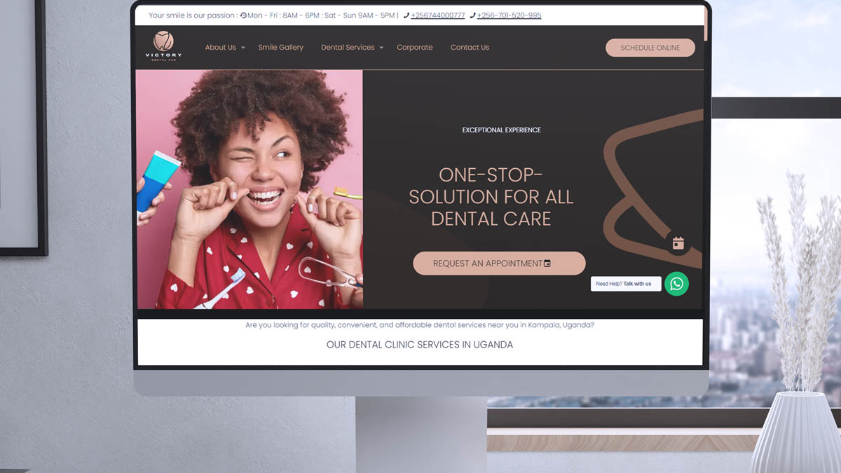
Responsive professional website redesigns
All of our professional website redesigns come with a fully responsive design, ensuring that your website will be accessible on all devices, from smartphones to tablets to widescreen desktop computers.
With a responsive design, there's no need to create a separate "mobile website." It's a simple and hassle-free solution that ensures your website looks great and functions perfectly on any device screen size.
Professional web copy
Our in-house team of experienced copywriters produces optimized website content aligned with your brand, company goals, web marketing strategy, and newly designed website.Custom website redesigns
Trophy Developers in Uganda offers custom website development services that will fit your desired needs. We can create a website using HTML or your preferred CMS. Whether you need a simple 10-page website or a complex 100-page build, Trophy Developers in Uganda can deliver with our custom website redesign services. Our custom designs allow you to integrate all the features you need to make your website stand out.
Rapid website designs
We understand that sometimes you need a website quickly. Our website redesign service offers a refreshed look in just 20 days.
To deliver your site in 20 days, our designers customize to your company and brand, from your custom logo to your company colors.
The website is now beautifully designed and fully responsive across all devices.
No Hidden tariffs/Fees
At Trophy Developers Uganda, we offer transparent pricing without any hidden fees. You can easily see where your money goes, whether you need to update the design of your e-commerce website or a large enterprise's website. Our pricing policy is fair and consistent for all clients.
Most business owners and top organization managers often hesitate to hire a professional web designer due to fear of making the wrong decision and not achieving the desired results for their online success.
Hire Trophy Developers to redesign your website and create a return on investment digital marketing strategies.
We develop cutting-edge web design solutions to drive results for clients in and out of Uganda.

Best Website Designers in Kampala, Uganda
Our web developers will apply
proactive approaches to your New Business Website
Therefore, ensuring that for every website we develop, stringent processes and practices are adhered to and maintained.
We value quality in our website redesign service, and High quality is key in everything we do.
Also, our Website design and support teams consist of professionals and staff with a mission of providing the best of our services to you as our highly esteemed client. Our experience in the website design industry spans from 2015 till now 2026, delivering exquisite web design experiences with affordable web Hosting in Uganda for Government organizations, NGOs, Hospitals, Schools, and many more.
At Trophy Developers in Uganda, we have experienced web developers who can turn your website idea into reality and make your website work for your business.
Our good web development is not limited to making sure that the website looks good. All websites designed and developed by Trophy Developers Uganda are created with high technical skills and knowledge ensuring that each website adheres 100% to the guidelines set by search engines such as Google.
Learn why businesses trust Trophy Developers to power growth.


Trusted by 715+ businesses like yours
We are Uganda's Best Web designers: Trophy Developers.
We empower over 715 businesses in Uganda: Read recommendations and also review us!
 715 reviews