Images and words - Web Design

How to Combine Images and Words in Website Design

Learn how to combine images and words so each element adds meaning, improves UX, supports accessibility, strengthens SEO and GEO, and helps business websites convert.

Image and copy working together in a website design layout
Article section image

IMAGES

Images and words should create more meaning together

01

A strong website does not place an image beside a paragraph and call the job finished. The image and the words should work as one communication system.

Our rule at Trophy Developers is simple: if the image already says everything the text says, one of them is probably unnecessary.

A photograph can create context, emotion, evidence or recognition. Copy can explain consequence, value, direction or action. When each element performs a different job, the visitor understands more with less effort.

This matters on business websites because users rarely arrive to admire individual design elements. They arrive to answer practical questions: What does this company do? Is it relevant to me? Can I trust it? What will I gain? What should I do next?

The best image-and-copy combinations help answer those questions faster.

At a glance

  • A strong website does not place an image beside a paragraph and call the job finished.
  • Before choosing an image, define its job.
  • A good visual concept still needs to work when a visitor cannot see the image, when the image fails to load, or when assistive technology reads the page aloud.
  • Image-and-copy relationships must survive responsive layouts.
  • Using stock photography as filler.
  • Image and copy are not separate decoration layers.

A poor image-and-copy combination repeats itself

02

A weak combination happens when the picture and the words communicate the same information without adding context.

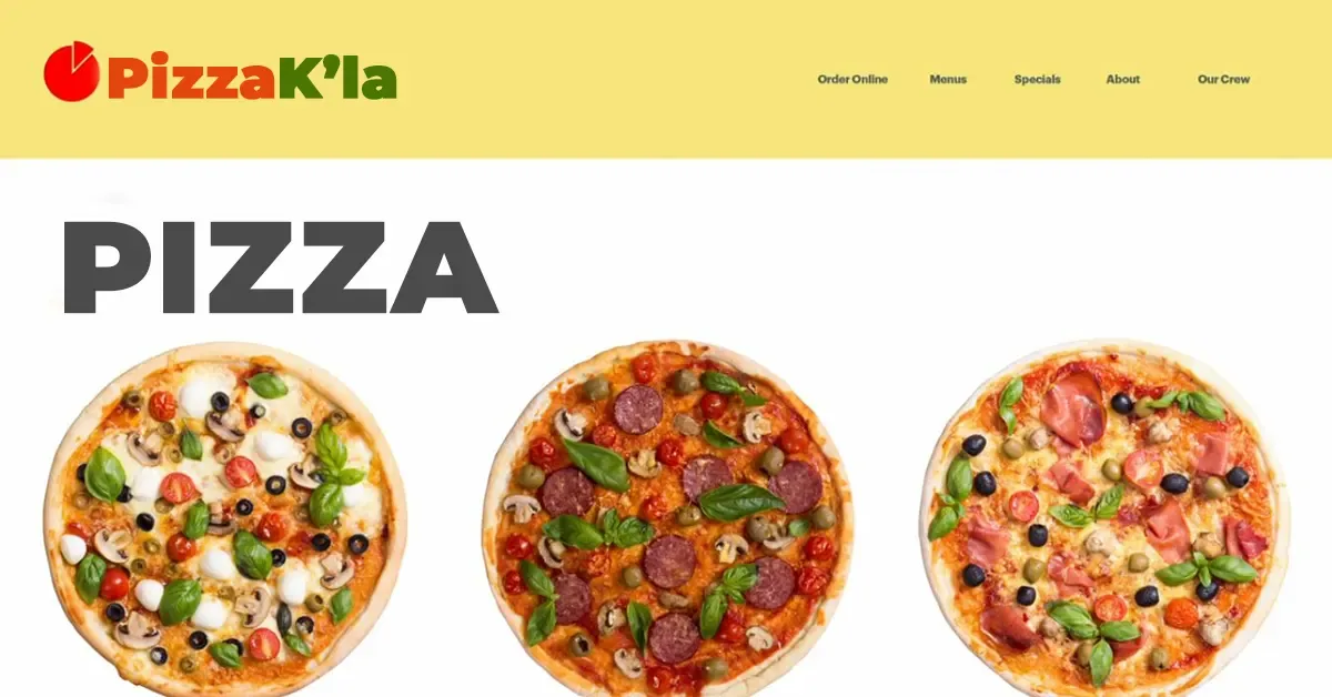
For example, imagine a hero image of a team holding a meeting with the headline “Our Team Having a Meeting.” The headline does not help the visitor interpret why that image matters. It simply labels what the visitor can already see.

This kind of repetition wastes attention. It also uses valuable screen space without moving the user closer to a decision.

A better headline changes the meaning of the image. The same meeting photograph could sit beside: “Turn disconnected departments into one digital workflow.” Now the image shows collaboration while the copy explains the business outcome.

The design has moved from description to communication.

A good combination creates a third meaning

03

The strongest relationship between image and copy is not image plus caption. It is image plus interpretation.

The visitor sees one idea in the image, reads another idea in the copy, and combines both into a clearer message.

Consider a website for a logistics company. A photograph of a delivery vehicle shows movement and operations. A headline such as “Know where every delivery stands before a customer asks” adds visibility, control and customer-service meaning. Neither element communicates the full idea alone.

That is the standard we aim for when designing websites: every visual should earn its space, and every important line of copy should advance the meaning.

This principle also reduces decorative clutter. If an image contributes nothing to comprehension, trust, emotion or action, we can remove it and give the content more space.

Five jobs an image can perform on a business website

04

Before choosing an image, define its job.

1. Show evidence. Use real project screenshots, facilities, products, people, dashboards, installations, events or results when they help prove a claim.

2. Explain something complex. Diagrams, interface visuals, annotated screenshots and process graphics can make a system easier to understand than another paragraph.

3. Create context. A relevant environment can help the visitor immediately understand the sector, use case or audience.

4. Create emotional direction. Photography and illustration can make a message feel urgent, reassuring, ambitious, human or premium. The copy should then explain what that feeling means for the user.

5. Improve recognition and recall. Distinctive, relevant imagery can make a company, service or idea easier to remember.

An image should not try to do all five jobs at once. Define the primary job first, then write copy that completes it.

The Trophy Developers process for combining images and words

05

We treat the image-and-copy relationship as part of the web design process, not as a finishing task.

Start with the user's decision. Define what the visitor needs to understand or decide at that point on the page.

Write the message before decorating the section. Clarify the value proposition, proof point or action in plain language.

Choose the visual role. Decide whether the image should demonstrate, explain, reassure, differentiate or create context.

Remove duplication. Read the copy while hiding the image, then view the image while hiding the copy. If both communicate exactly the same thing, revise one of them.

Design the hierarchy. The visitor should know where to look first, what to read next and where to act. Image size, copy length, spacing, contrast and alignment all affect that sequence.

Test across devices. A composition that works on a large desktop can fail on a 360-pixel mobile screen. Crop, stacking order and text length must survive responsive layouts.

Check accessibility and search context. Use meaningful alternative text for informative images, keep essential copy as real HTML text, and place relevant text near the visual.

Measure the result. On high-value pages, review engagement, clicks, form starts, conversion paths and qualitative user feedback. Design decisions should support a measurable business or communication goal.

Design for scanning before designing for reading

06

People often scan web pages before they commit to reading them. That makes visual hierarchy part of the content strategy.

A visitor should be able to understand the structure of a page from its headings, key sentences, imagery, labels and calls to action before reading every paragraph.

Use one main idea per section. Keep headings descriptive. Place the most important meaning early. Avoid long decorative introductions that delay the answer.

Images should strengthen that scan path. A service screenshot beside a clear outcome statement can help a visitor understand the section in seconds. A generic stock photo beside vague copy does the opposite: it adds visual weight without adding information.

This becomes especially important for decision-makers who may be comparing several providers, internal teams preparing procurement shortlists, or international clients trying to understand a Ugandan company quickly.

Accessibility changes how we think about image and text

07

A good visual concept still needs to work when a visitor cannot see the image, when the image fails to load, or when assistive technology reads the page aloud.

That is why essential information should normally remain in real text rather than being baked into an image.

For informative images, alternative text should communicate the useful information or purpose of the visual. Decorative images can use an empty alt attribute so screen readers do not announce unnecessary detail. Functional images, such as an icon used as a button, need text that explains the action rather than the shape of the icon.

A practical test is simple: remove the image. Does the user still understand the essential message and action? If not, the page relies too heavily on visual information.

Accessible design usually produces clearer communication for everyone, not only users of assistive technology.

Image and copy decisions also affect SEO

08

Search engines interpret images partly through the page around them. The image file alone does not carry the full context.

For important images, use descriptive filenames where practical, meaningful alt text, relevant surrounding copy and standard HTML image elements. Keep the landing page focused on the same subject as the image.

Do not stuff keywords into alt text. Describe what matters in the visual and how it relates to the page.

Performance also matters. Large, poorly compressed images can slow a page, especially on mobile connections. Use responsive image techniques, appropriate dimensions and modern formats so a high-quality visual does not create an unnecessary performance cost.

The SEO principle is the same as the design principle: make the image useful in context.

What this means for GEO and generative search

09

Generative search does not make strong web fundamentals obsolete. It increases the value of clear, specific and source-worthy content.

For a page to be useful to people and interpretable by search and AI systems, the important meaning should exist in crawlable text. Images can support that meaning, but they should not hide essential facts inside pixels.

Good GEO-oriented content makes entities, relationships and answers explicit. Name the service, problem, audience, location or process when it genuinely matters. Explain how something works instead of relying on slogans. Use original examples, first-hand experience, screenshots, diagrams and evidence when they add value.

Avoid creating artificial “GEO tricks” that make the page worse for people. Google’s current guidance for generative search still emphasizes established SEO fundamentals, people-first content, technical accessibility, useful images and videos, and structured data that matches visible content.

In practice, the best optimisation is often editorial clarity: answer the question directly, support the answer visually, and give enough context for both a person and a machine to understand why the information is credible.

Responsive design can change the meaning of an image

10

Image-and-copy relationships must survive responsive layouts.

On a large desktop, a photograph may sit beside a headline and supporting paragraph. On mobile, the image may move above the text. A crop may remove the person, product or interface detail that originally created the meaning. A headline may wrap into five lines and overpower the visual.

Designers should review the relationship at every important breakpoint, not only check whether the layout technically fits.

Ask:

  • Does the crop preserve the subject?
  • Does the copy still make sense when the image stacks above it?
  • Is the key visual detail large enough to understand?
  • Does the text remain readable over any background image?
  • Can the user reach the main action without fighting the composition?
  • Does the image add enough value to justify its download cost on a smaller device?

Responsive design is not just resizing. It is preserving communication as space changes.

Different page types need different image-and-copy relationships

11

Homepage: Use images to establish relevance and credibility quickly. Pair them with copy that explains the business value, not with generic descriptions of what the visitor can already see.

Service page: Show the service in action, a relevant interface, process or outcome. Use copy to explain the problem solved, who the service fits and what changes after implementation.

Case study: Let imagery act as evidence. Project screens, prototypes, before-and-after states and implementation details can support a narrative about the challenge, decisions and verified outcomes.

Product or e-commerce page: Images should reduce uncertainty about the product. Copy should answer specifications, suitability, delivery, trust, price or purchase questions.

Government or public-sector page: Prioritise clarity, legitimacy, accessibility and task completion. Visuals should help users identify services, processes, locations or evidence rather than distract from essential information.

Campaign landing page: Keep the relationship tightly focused on one action. The visual should support the offer or problem, while the copy explains relevance, proof and the next step.

Use a decision framework before publishing

12

Before approving an image-and-copy combination, ask seven questions.

  1. What should the visitor understand after seeing this section?
  2. What does the image contribute that the copy does not?
  3. What does the copy contribute that the image does not?
  4. Is the most important information still available as real text?
  5. Does the combination remain clear on mobile, tablet and desktop?
  6. Does the visual support the page’s search topic rather than distract from it?
  7. What user action or business outcome should this section support?

If the team cannot answer these questions clearly, the design probably needs another iteration.

Common mistakes we avoid

13

Using stock photography as filler. A generic handshake or laptop image rarely proves anything about the business.

Writing captions that simply describe the picture. The copy should add interpretation, relevance or consequence.

Putting essential copy inside the image. This weakens responsiveness, accessibility and content flexibility.

Choosing visual style before understanding the message. The communication problem should lead the design direction.

Adding too many competing focal points. One section should normally have a clear primary message and action.

Ignoring image performance. An impressive visual that slows the page can damage the experience it was meant to improve.

Optimising for keywords instead of meaning. Relevance comes from useful context, not repetition.

Treating mobile as a smaller desktop. Mobile often needs different crops, spacing, ordering and copy length.

Quick takeaways for business owners and web teams

14
  • Do not use an image merely because the section looks empty without one.
  • Give every important image a defined communication role.
  • Let image and copy perform different jobs.
  • Keep essential meaning in real text.
  • Use specific, useful alt text for informative images.
  • Design the relationship for scanning as well as deep reading.
  • Test crops and stacking across device sizes.
  • Prefer original evidence over generic decoration when trust matters.
  • Keep image files efficient so visual quality does not undermine performance.
  • Write for people first; strong SEO and GEO usually follow from clear, useful, well-structured information.

The target is not “more visual.” The target is faster understanding with stronger meaning.

Frequently asked questions

15

Should website text repeat what an image shows?

Usually, no. The copy should add context, interpretation, value or direction. Repetition is useful only when accessibility, safety or task clarity requires the same information in more than one form.

Should text be placed inside images?

Avoid it for essential information. Real HTML text responds better across devices, remains selectable, supports accessibility and gives search engines clearer access to the content.

Do images help SEO?

They can. Relevant, discoverable and well-optimised images can support search visibility, especially when they use meaningful alt text and appear near relevant page content. They also need appropriate performance optimisation.

What is the difference between a caption and supporting copy?

A caption identifies or explains an image. Supporting copy can do more: it can interpret the visual, connect it to a business problem, explain why it matters or guide the next action.

How do images support GEO or AI search visibility?

Images can strengthen useful, original content, but important facts should remain in crawlable text. Clear entities, direct answers, first-hand evidence and relevant context make a page easier for both people and AI-powered search systems to interpret.

How many images should a web page use?

There is no useful universal number. Use enough imagery to explain, prove, orient or motivate without adding unnecessary page weight or distracting from the primary task. Every important image should have a reason to exist.

The goal is stronger meaning, not more content

16

Image and copy are not separate decoration layers. Together they shape what users notice, understand, remember and trust.

For business owners, marketing teams, IT teams, public-sector organisations and international companies, this matters because a website often has only a short window to establish relevance.

At Trophy Developers, we treat the relationship between content, interface, imagery, performance, accessibility and search visibility as one design problem. The website should help a person understand the message quickly, verify the important details and move confidently to the next step.

That is the difference between placing images beside words and designing communication.

Posted by Trophy Developers
Creative DesignStep By Step Guide For BeginnersUx Layouts

Next step

Find the digital gaps costing your business customers, time, or revenue.

Start with a Digital Growth Audit. We review visibility, conversion, operations, payments, security, and measurement before recommending the right system.